Sunday, 29 January 2012

Victorian era advertising


My example of Victorian era advertising is a poster, titled, "Flour of the Family", designed by the
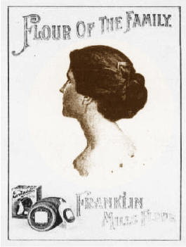
Rochester Folding Box Company around late Victorian era, 1980-1990, for Franklin Mills Flour.  Victorian advertising at this time was very ornate with well crafted, hand drawn typography and intricate boarders.  This example does not include as many flourishes, however, it does feature the hand-drawn typography and detailed realistic illustrations, that were popular at this time.  At the end of the Victorian era designs were less intricate however they still stuck to the symmetrical, idealized beauty, and romanticized illustration that defines this movement. There is quite an interesting back story to this poster, Apparently the woman featured in it never gave her consent, for her photo to be used.  She had some photographs taken by a photographer and he must have sold one of the negatives to the designer of the poster.  To her surprise her picture ended up on 25,000 of these posters all around Lockport, England.  The embarrassment and shock lead to her mental instability, and she filed a lawsuit against Franklin Mills. 
I found my example on http://harvardpress.typepad.com.

Monday, 23 January 2012

Renaissance

This is my Renaissance page layout.  My rendition was inspired by Geoffroy Tory's pages from Horae in Laudem Beautissim ce Virginis Mariae (Hours of Our Excelent Virgin Mary), 1541.  This was a religious text that's function was to spread ideas/views of the church.  He decorated his pages with borders filled with natural plant and animal illustrations in an outline like style so they could be easily coloured in by hand later.  This detailed border illustrations were typical for the time and the audience would be expecting this kind of decoration and religious content.

Wednesday, 4 January 2012

Graphic Design from the 21st Century that has been influenced/ inspired by ancient Egyptian hieroglyphic forms.


 My example is a set of icons created by Graphic Designer, Tim Boelaars.  Most of his work has a similar style using simple contour outlines and geometric shapes.  These icons in particular reminded me of a kind of revitalized set of hieroglyphics with an increased amount of modern rounded edges.  The exact function of these I am not too sure on, but perhaps directory buttons one would find on a webpage?  If not they are still wonderfully simplified pictorial icons that stand for what they represent, just as the Egyptian hieroglyphics do.  I discovered this work originally on ffffound.com, which is a really cool image bookmarking site that I follow from time to time due to its incredibly rich supply of innovative design, remarkable photography, and anything else visual.