Tuesday, 20 March 2012

International Modern Style Poster


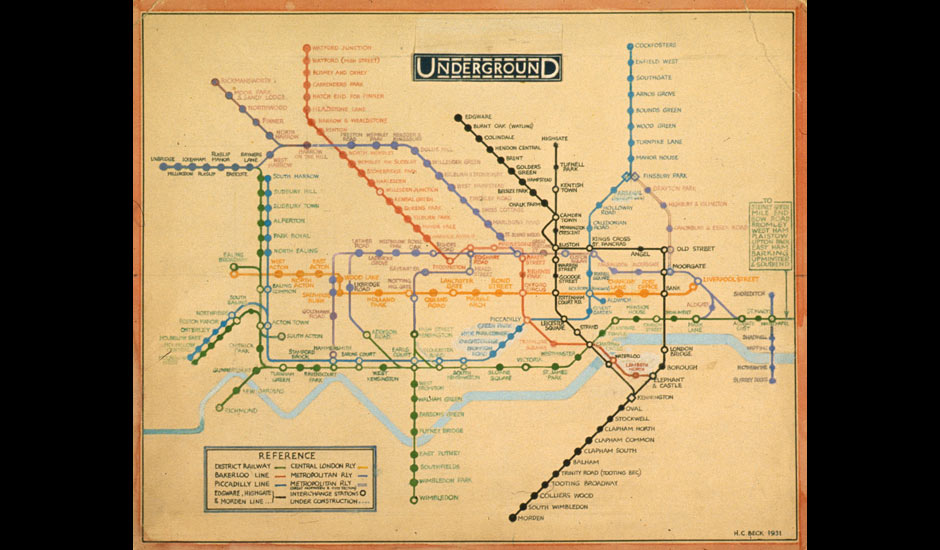
The International Modern Style's minimalistic style has been utilized by marketing giants to grow recognition to their corporation brand.  This has been occurring since this sort of overall company branding first began to become common place during this era.  I used the Chanel logo because of its simplicity and it's wide global recognition as an clothing brand and as a status symbol.  Many Companys including Chanel, use the effectiveness of the simplistic logo to enhance the brand's name.  It gives ultimate power to the corporation and by doing so is creating this materialistic society that we live in today.

Monday, 12 March 2012

Graphic Design Manifesto:


Designers are a huge part of creating mainstream culture.  They express all sorts of communication through various outlets, and to every kind of demographic out there. This gives us immense power and responsibility as it heavily influences society. Personally I could not create a good design for something that conveys a message that I would not be willing to stand for. It is hard to put into words but when I design I try to immerse myself as much as possible to try and understand the message and represent it as truly as possible.  If this message was something I could not agree with I don’t know that anything decent would come out of it.  In my future design career I hope to never disregard any of my current ethical standings and give into greed, but instead pursue jobs that better mankind and say something that I would want my name associated with. 

Monday, 13 February 2012

London Underground Map 1931

This week our class was asked to look at "The London Underground Map", designed by Henry C. Beck in 1931.   The typeface used in this map is called Johnston's Railway Type.  It was originally designed by Edward Johnston in 1916, then hand-lettered in over 2,400 characters by Beck 15 years later.  Johnston's Railway Type influenced many faces following it, with similar qualities of ultimate simplicity, and readability.  The concept behind the structure of the map is to simplify the complex web of the subway stations and replace it with a easy to read diagrammatic representation instead of an accurate, but more complex, geographic one.  This aesthetic of simple contrasts in shapes and colours related to the current progress in Graphic Design at the time, where legibility and understanding were achieved by thoughtful reduction and bright colours.  Personally I like this map design.  It's simple, perfectly functional, and in its simplicity is aesthetic appeal.  With this map I think I could find my way in London or at least in 1931.

Monday, 6 February 2012

Seriously? The Pictorial Modernism Movement

 This is my Serious Coffee logo rendition.  I was inspired by the Pictorial Modernism movement, specifically, designer, Julius Klinger and his poster design work.  Klinger along with many other artists at this time (early 20th century) veered away from decorative Art Nouveau and started using clean, San-serifs, and 2D shapes against a flat background.  My example is similar to his style, except for the lack of colour.  The Pictorial Modernism movement is famous for using bright colours however do to the criteria of this weeks blog I had to stick to just the black and white.  Although my sample does feature thoughtful reduction, which was popular during this movement and with Plakatstil (poster design).  Artists were trying to convey meaning in the simplest way possible often only using flat shapes, colour, product name, and the product.  I reduced the number of coffee beans and steam swirls because I felt the logo could still be understood with less "flourishes".  The audience that this logo would appeal to is people that enjoy the basics, perhaps fans of the Pictorial Modernism movement or Someone who is just "Serious" about their coffee and doesn't need anything extra.

Sunday, 29 January 2012

Victorian era advertising


My example of Victorian era advertising is a poster, titled, "Flour of the Family", designed by the
Rochester Folding Box Company around late Victorian era, 1980-1990, for Franklin Mills Flour.  Victorian advertising at this time was very ornate with well crafted, hand drawn typography and intricate boarders.  This example does not include as many flourishes, however, it does feature the hand-drawn typography and detailed realistic illustrations, that were popular at this time.  At the end of the Victorian era designs were less intricate however they still stuck to the symmetrical, idealized beauty, and romanticized illustration that defines this movement. There is quite an interesting back story to this poster, Apparently the woman featured in it never gave her consent, for her photo to be used.  She had some photographs taken by a photographer and he must have sold one of the negatives to the designer of the poster.  To her surprise her picture ended up on 25,000 of these posters all around Lockport, England.  The embarrassment and shock lead to her mental instability, and she filed a lawsuit against Franklin Mills. 
I found my example on http://harvardpress.typepad.com.

Monday, 23 January 2012

Renaissance

This is my Renaissance page layout.  My rendition was inspired by Geoffroy Tory's pages from Horae in Laudem Beautissim ce Virginis Mariae (Hours of Our Excelent Virgin Mary), 1541.  This was a religious text that's function was to spread ideas/views of the church.  He decorated his pages with borders filled with natural plant and animal illustrations in an outline like style so they could be easily coloured in by hand later.  This detailed border illustrations were typical for the time and the audience would be expecting this kind of decoration and religious content.