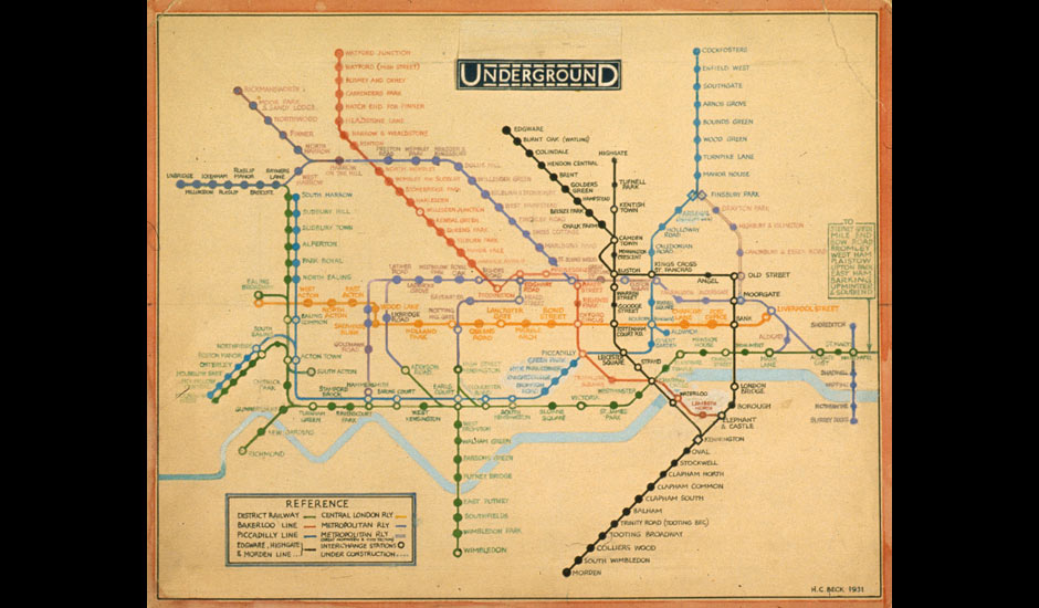
This week our class was asked to look at "The London Underground Map", designed by Henry C. Beck in 1931. The typeface used in this map is called Johnston's Railway Type. It was originally designed by Edward Johnston in 1916, then hand-lettered in over 2,400 characters by Beck 15 years later. Johnston's Railway Type influenced many faces following it, with similar qualities of ultimate simplicity, and readability. The concept behind the structure of the map is to simplify the complex web of the subway stations and replace it with a easy to read diagrammatic representation instead of an accurate, but more complex, geographic one. This aesthetic of simple contrasts in shapes and colours related to the current progress in Graphic Design at the time, where legibility and understanding were achieved by thoughtful reduction and bright colours. Personally I like this map design. It's simple, perfectly functional, and in its simplicity is aesthetic appeal. With this map I think I could find my way in London or at least in 1931.
Great job, thanks Dahlia,
ReplyDeleteJ